- CATEGORY: MY CHOICES FOUNDATION
Announcing our rebranding: My Choices Foundation
We’ve re-branded. We’re still doing the same, amazing work. Just with different names and cooler logos.
We keep moving forward, opening new doors, and doing new things, because we’re curious and curiosity keeps leading us down new paths. – Walt Disney
Anything new is always exciting and it leads us to paths undiscovered. Today, we too have something new and exciting to share with you all. You’ve seen the sneak peeks, but this is the official announcement! Yes – we’ve rebranded!
The original My Choices logo. 2012 – 2015.
The name ‘My Choices’ has been our identity for over 3 years now, and we LOVE this name too much to let go of it. Therefore, ‘My Choices’ has become our mother brand of two distinct operations and become the My Choices Foundation. We have a new look to our visual identity and have honed in on what the true ethos of My Choices is. You might be wondering why we need a mother brand?
We have been thinking about the organisational efficiencies of two separate NGOs, My Choices working in the area of ‘Anti Domestic Violence’ and Red Alert working in the area of ‘Anti Human Trafficking’ for some time now. While the two NGOs always had a significant amount of overlap of teams, resources, and messaging, they have up until now been marketed to supporters, partners and clients as distinct entities. The close association and common objectives become increasingly difficult to communicate to our key stake holders. Connecting the two took far too much elaborating. So why not let our branding speak for itself – that’s the point isn’t it?
Today, we want to re-introduce you to the two NGOs you have been following and supporting, not as two NGOs, but as one Foundation with two distinct but complimentary set of Operations.
The Mission
The My Choices Foundation started as a response to an issue that is so prevalent that it affects every household in India in some form. Violence against women and girls. While not every household experiences or witnesses violence within it’s own walls, at least one member of that family is certain to be exposed to it in some form whether first hand or through the experience of another person. Yet at around 60% of Indian homes do face violence at home.
The first response to this violence was to develop a program that would address the type of violence that is perhaps the most intractable, yet sits at the root of every other category of violence against women and girls: Domestic violence. By targeting the household, Operation PeaceMaker aims to access the very home of the mindsets that perpetuate violence and discrimination against women and girls. The home, just like the mindsets they house, is one of the most difficult spaces to access and difficult to affect change from within. PeaceMaking, getting families to work together to end violence against women and girls, is tremendously focussed work, and our efforts have stayed local in Andhra Pradesh and Telangana for the last 3+ years. Yet, we have long known of and been stirred by another massive dearth in education allowing families to be fooled and the lives of young girls and women destroyed.
The second response has been to address one of the most harrowing forms of violence: trafficking of young girls for sexual exploitation. Focussed on pre-empting girls and their families from falling off the cliff so to speak into exploitation, Operation Red Alert has worked for over one year on research, ground work, and networking to take shape into three major pillars of action.
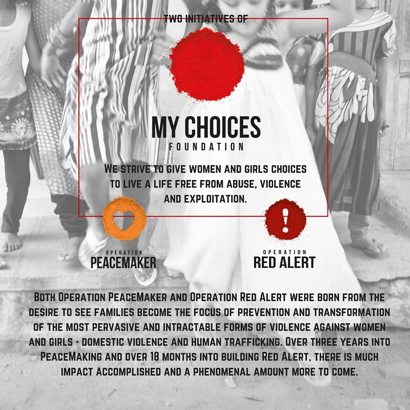
Both Operation PeaceMaker and Operation Red Alert have been born from the desire to see families to become the focus of prevention and transformation of the most pervasive and intractable forms of violence against women and girls. Over three years into PeaceMaking and over one year into building Red Alert, there is much impact accomplished and a phenomenal amount more to come. There is no better time for every one of the supporters, friends, partners, and clients of both Operation PeaceMaker and Operation Red Alert to understand the common values and missions of both operations and how our teams work independently as well as together across these.
To help make our story and work clear, we have rebranded our logos and positioned them under a single Foundation, The My Choices Foundation. We believe that while both missions or operations are distinct, their success commonly relies on the choices of educated and empowered men, women, boys, and girls.
Our work is all about giving women and girls choices to live a life free from abuse, violence and exploitation. That has, and will continue to be, our guiding principle, and our new brand will reflect that. It’s a reflection of the journey we’ve been on for the last 3 years.
The Logos
The My Choices Foundation has been built on the vision of restoring the spice of life into the lives of women, girls and families, and making sure that this spice is never diminished by discrimination, exploitation, or violence. The most powerful spice in the Indian arsenal of vibrant flavors is mirchi (red chili powder), and red is the traditional color of many Indian festivals and celebrations. The My Choices Foundation logo is a heaping, circle of red powder. It is vibrant, it is Indian, it is bold, it is versatile, and it is a beacon of a life lived with zest and fullness.
The DNA of Operation PeaceMaker, once called “My Choices”, is bravery, compassion, and truthfulness. The turmeric yellow embodies the ideals of health and happiness that we hope can be the trophies of transformation in the lives of our clients. The heart is symbolic of both the goal of internal transformation in the lives of our clients and their families, and of our PeaceMakers who, choosing everyday to love a difficult world, are the bravest hearts you can find. The Operation PeaceMaker invites us all to join the story of peace-in-the-making.
Operation Red Alert as the name suggests aims to get people on alert for human trafficking.The red powder in the logo reflects the spice of life. Red colour is energizing, it excites the emotions, inspires urgency, and motivates us to take action. Similarly, the exclamation mark expresses strong emotion, urgency and action. The Red Alert logo aims to affect this kind of response in each person in India. It aims to trigger the emotion within us to take action and STOP this injustice! If we are alert, she will be safe! #BEONREDALERT
